List Form Component

Overview

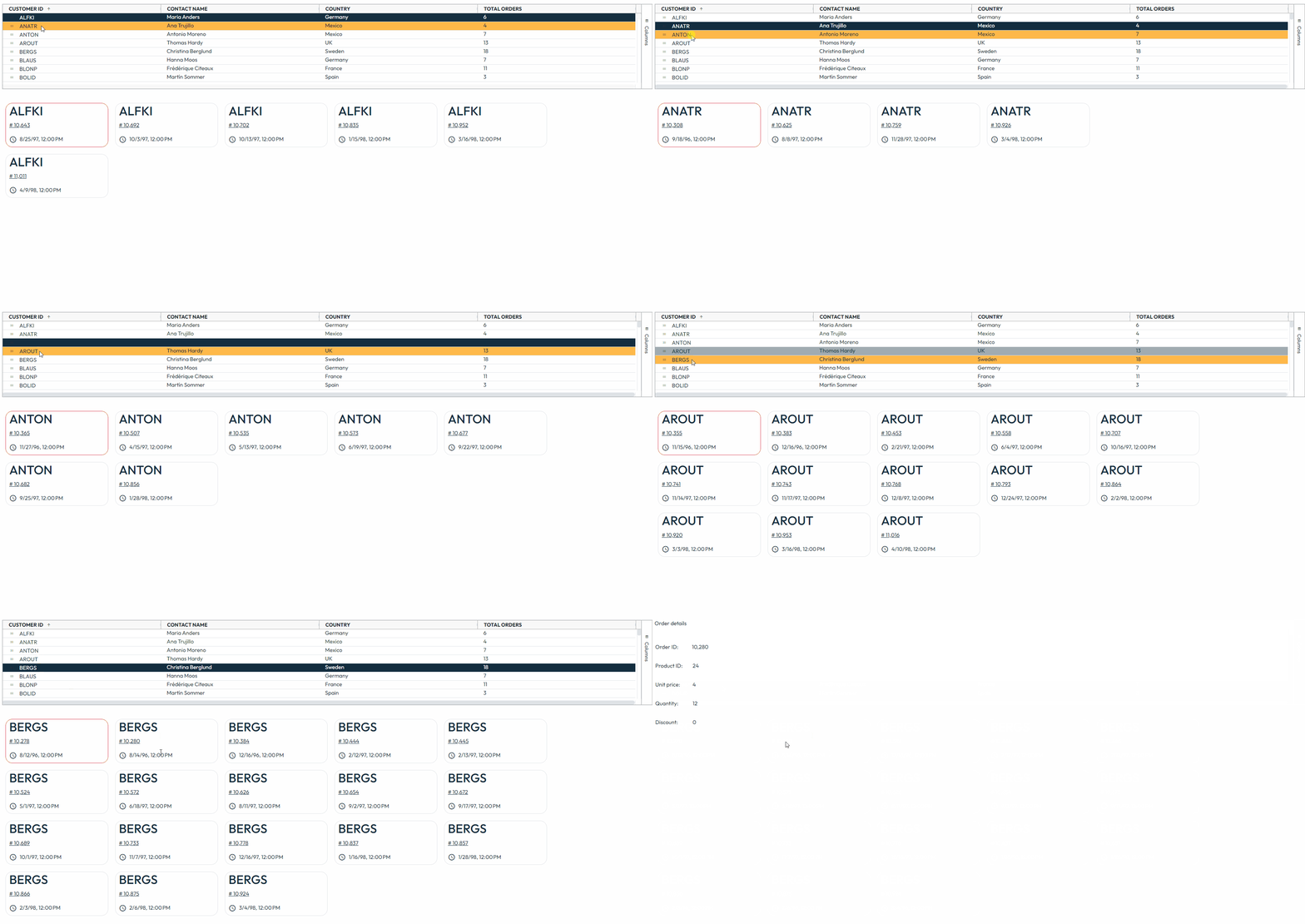
The "List Form Component Container" component is a container that has 1 Form Component inside it. However, it displays in the application one instance of the contained form component for each record of the foundset. It has no additional UI decorations. The contained form component can optionally show related data.

It is suited for use in both Advanced (Responsive) and Simple CSS forms.

List Form Component Container is used most often in Advanced (Responsive) forms, as the space it takes on the screen depends on how many instances of the contained form component are shown. When used in Simple CSS forms and the space taken by the contained form component exceeds the allocated space on the main form, there will be a scroll inside the List Form Component Container.

Form Components are an advanced feature. Please first see other Form Container types to explore options for nesting forms within forms.

Get Started

Placing a container on the form

Here are the steps for placing a container on the form:

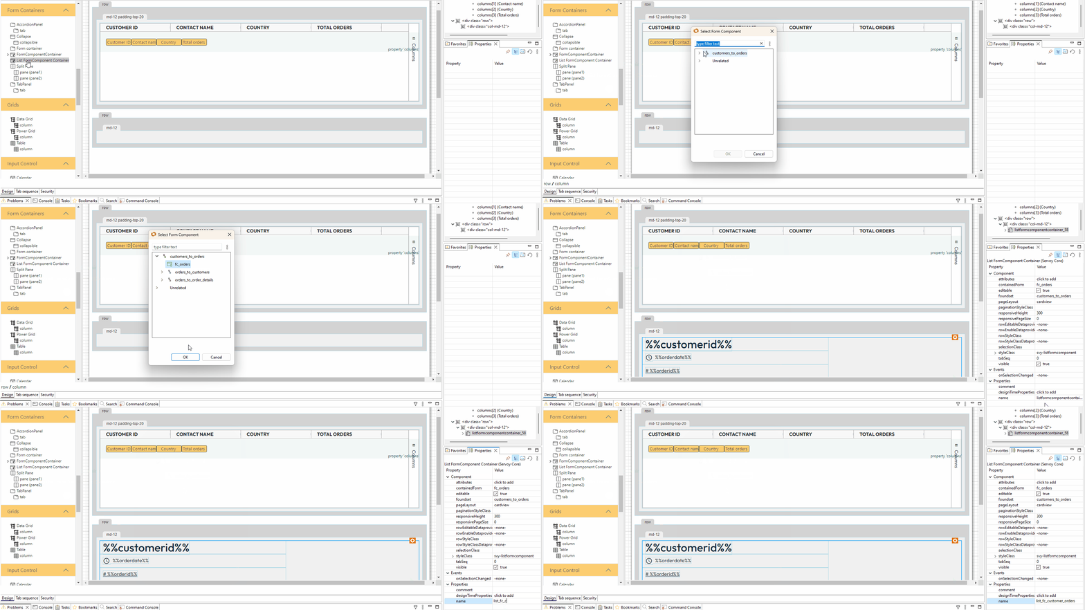
  1. Open the Form Editor of the form where you need to place an List FormComponent Container

  2. Find List FormComponent Container in Form Containers section in the components' pallet

  3. Drag and drop the List FormComponent Container component in the desired place of the form, the Select Form Component wizard will appear

  4. Select the desired Form Component (it can be related or unrelated to the form's dataSource), then click OK

  5. Edit the elements of the contained Form Component, when it's necessary

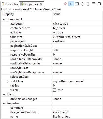
It is recommended to set a specific name in the List Form Component Container properties in order to make it easier to use it later in scripting. Example: list_fc_customer_orders.

List view vs Card view

Instances of the contained form component can de displayed in two ways:

  • List View : instances are displayed one under the other
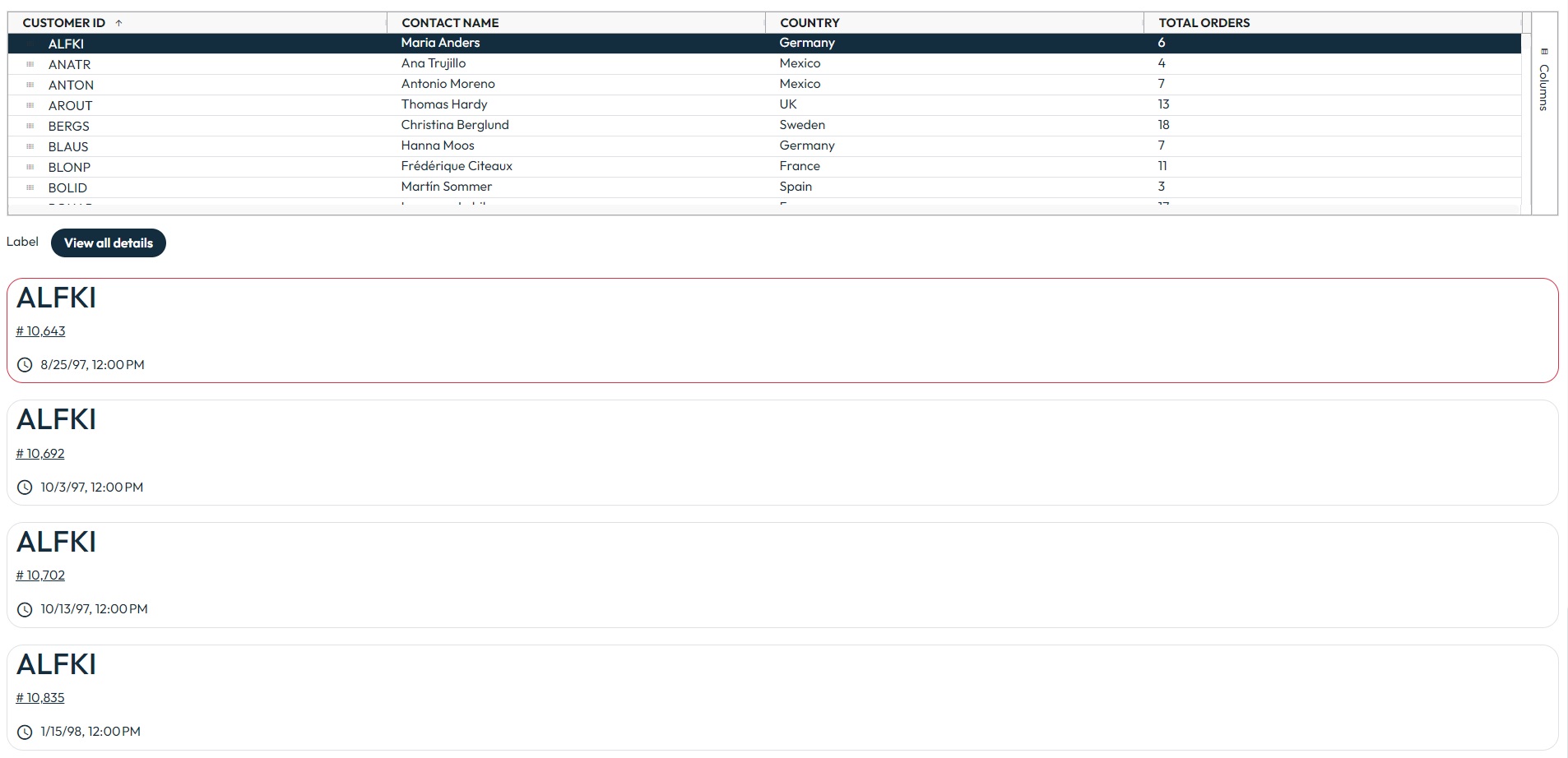
This view can be obtaiend by selecting listview in the List Form Component Container pageLayout property

  • Card view : instances are displayed as cards, on multiple columns and rows (when the case)

This view can be obtaiend by selecting cardview in the List Form Component Container pageLayout property

Working with the Form Component instance

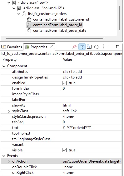
Connecting event bindings

Because a Form Component form doesn't have its own logic (.js file), events like onAction of an element can be assigned only to scopes or entity methods.

Example:

You can add logic for a label created in a Form Component form (placed in a Liat Form Component Container) by accessing that label in the main form and assign the label events to the main form's scope (.js file):

/**
 * Click event. dataTarget parameter is used to identify inner html elements (by their data-target attribute).
 *
 * @param {JSEvent} event
 * @param {String} dataTarget
 *
 * @private
 *
 * @properties={typeid:24,uuid:"63DEB955-288A-4F7C-9D04-280A9C34CE8F"}
 */
function onActionOrderID(event, dataTarget) {
	application.showForm('orders');
}

Programmatic interaction with elements

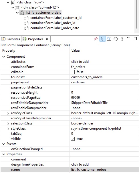
Elements of a contained Form Component can be accessed in the main form where its List Form Component Container is placed.

Example:

/**
 * Callback method for when form is shown.
 *
 * @param {Boolean} firstShow form is shown first time after load
 * @param {JSEvent} event the event that triggered the action
 *
 * @private
 *
 * @properties={typeid:24,uuid:"9DB5DBBA-A3E2-4090-85BA-3957A1146421"}
 */
function onShow(firstShow, event) {
	elements.list_fc_orders.containedForm.label_customer_id.addStyleClass('info-text');
    //list_fc_orders = the name of the List Form Component Container
}

Advanced

Selection Class

The user can define a custom style for the selected instance of the contained form component, using the List Form Component Container SelectionClass property.

In case rowStyleClassDataprovider or rowStyleClass are used, make sure that the selection styleclass definition is last in the solution stylesheet, to avoid overwriting it.

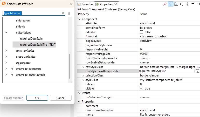
Row Style Class Data Provider

This property adds a adds a styleclass to the row. It is usually used in combination with a calculation to parse a piece of text that is used as the styleclass.

Example:

Having a different background color according to an order delivery date. To achieve this there are a few steps to be followed:

  • create a calculation in orders table:

/**
 * @properties={type:12,typeid:36,uuid:"E25F53FD-7B0D-4BAB-8843-6E5A1C86E101"}
 */
function requiredDateStyleTile()
{
	if (requireddate.getFullYear() < 1997)
	{
		return 'bg-red';
	}
	if (requireddate.getFullYear() == 1997)
	{
		return 'bg-yellow';
	}
	return '';
}
  • make sure the the classes used in calculation exist, otherwise create them in a .less file:

.bg-red{
	background-color: red;
}

.bg-yellow{
	background-color: yellow;
}

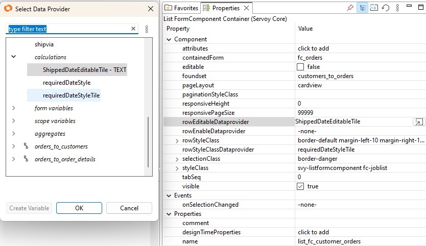
Row Editable Data Provider

This is a dataprovider that will return true or false. In case it is true, that row is editable, otherwise it is not.

Example:

Having a read-only card/row according to an order shipped date:

  • in case there is not already a boolean table column of the foundset/datasource, then a calculation is needed:

orders_calculations

/**
 * @properties={type:12,typeid:36,uuid:"05E3332F-DDA1-45BF-A428-FCD6A20EA960"}
 */
function ShippedDateEditableTile()
{
	if (shippeddate <= new Date())
	{
		return false;
	}

	return true;
}

-->

Last updated