> For the complete documentation index, see [llms.txt](https://docs.servoy.com/llms.txt). Markdown versions of documentation pages are available by appending `.md` to page URLs; this page is available as [Markdown](https://docs.servoy.com/guides/develop/programming-guide/browser-utilities/notifications/web-notifications-toastr.md).
# Web Notifications (Toastr)
## Overview
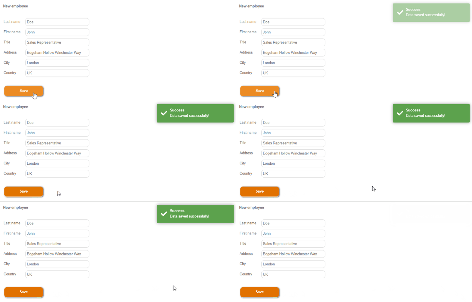
Toastr Web Notification
ToastR is a lightweight and flexible web widget for displaying in-app notifications. These notifications are ideal for providing brief, non-intrusive feedback to users, such as status updates, error messages, or success confirmations. ToastR notifications can be highly customized to fit the look and feel of your application.
The [plugins.webnotificationsToastr](/reference/servoyextensions/browser-plugins/toastr-notifications.md#toastr-notifications-ref) API allows you to create and manage these notifications efficiently, with options for global settings, animation, and event handling.
{% hint style="info" %}
To be able to use Toastr Web Notifications, the Web Notifications package must be added from Services section of [Servoy Package Manager](/reference/servoy-developer/package-manager.md#package-manager). It can be accessed by code using `plugins.webnotificationsToastr`.
{% endhint %}
**Key Features**:
* **Customizable Content**: Easily define titles, messages, and styles for your notifications.
* **Support for Actions**: Include interactive elements like action buttons to enhance user engagement.
* **Positioning Options**: Choose where notifications appear on the screen (e.g., top-right, bottom-left).
* **Visual Feedback**: Add progress bars, animations, and HTML content for enhanced visuals.
* **Event Handling**: Attach callback functions to handle user interactions, such as clicks or button presses.
* **Global and Individual Settings**: Set default configurations globally or customize individual notifications as needed.
ToastR web notifications implementation is based on the NGX-TOASTR. You can find information about this library [here](https://github.com/scttcper/ngx-toastr).
## Use Cases
ToastR notifications are versatile and can be used in various scenarios to improve user experience and communication within the application. Here are some common use cases:
* **Acknowledgements**:
* Notify users of successful actions, such as form submissions, data saving, or record updates.
* Example: `"Your profile was updated successfully."`
* **Error Handling**:
* Alert users about issues like validation errors, failed processes, or missing inputs.
* Example: `"Error: Unable to connect to the server."`
* **Informational Updates**:
* Share announcements, reminders, or system messages without interrupting the user's workflow.
* Example: `"Scheduled maintenance will occur at 10:00 PM."`
* **Warnings**:
* Caution users about potentially harmful actions, such as deleting important data or navigating away with unsaved changes.
* Example: `"Warning: Unsaved changes will be lost if you leave this page."`
* **Interactive Prompts**:
* Use action buttons to let users confirm or cancel (close button) actions directly within the notification.
* Example: `"Do you want to proceed with the operation? [Proceed]"`
## Types
ToastR supports four main types of notifications, each with a specific purpose and visual style:
### Success
[Success](/reference/servoyextensions/browser-plugins/toastr-notifications.md#success) notifications are designed to celebrate or acknowledge positive outcomes. They are usually green to signal success.
Example:
```javascript
plugins.webnotificationsToastr.success(
"Your data has been saved successfully!",
"Success",
{ progressBar: true }
);
```
### Info
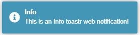
[Info](/reference/servoyextensions/browser-plugins/toastr-notifications.md#info) notifications are neutral and typically blue. They are ideal for sharing general updates or non-critical information.
Example:
```javascript
plugins.webnotificationsToastr.info(
"Don't forget: Servoy World is coming up!",
"Reminder"
);
```
### Error
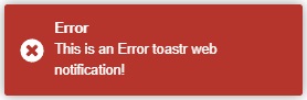
[Error](/reference/servoyextensions/browser-plugins/toastr-notifications.md#error) notifications are red and signal issues or problems that need attention. They are effective for displaying critical messages.
Example:
```javascript
plugins.webnotificationsToastr.error(
"An error occurred while processing your request.",
"Error",
{ closeButton: true }
);
```
### Warning
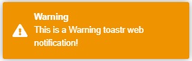
[Warning](/reference/servoyextensions/browser-plugins/toastr-notifications.md#warning) notifications are typically yellow or orange. They are used to caution users about potential risks or actions.
Example:
```javascript
plugins.webnotificationsToastr.warning(
"Unsaved changes will be lost if you exit now.",
"Warning",
{ disableTimeOut: true }
);
```
## Options
The ToastR API provides several configuration [options](/reference/servoyextensions/browser-plugins/toastr-notifications.md#toastroptions) to customize the behavior and appearance of notifications. These options can be set globally using [setGlobalOptions()](/reference/servoyextensions/browser-plugins/toastr-notifications.md#setglobaloptions) or individually for each notification.
Available Options:
* **actionButton**: Enables a custom button within the notification for additional user actions.
* example: `actionButton: true`
* **actionButtonText**: Specifies the text for the action button, which can also include HTML.
* example: `"actionButtonText: Learn More"`
* **closeButton**: Adds a close button to the notification for manual dismissal.
* example: `closeButton: true`
* **disableTimeOut**: Prevents the notification from closing automatically, requiring manual dismissal.
* example: `disableTimeOut: true`
* **enableHtml**: Allows the notification message to include HTML content.
* example: `enableHtml: true`
* **extendedTimeOut**: Sets the delay (in milliseconds) before the notification closes after user interaction.
* example: `extendedTimeOut: 5000`
* **hideDuration**: Sets the duration (in milliseconds) for the hide animation when the notification closes.
* example: `hideDuration: 2000`
* **positionClass**: Determines where the notification appears on the screen (e.g., top-right, bottom-left).
* example: `positionClass: "toast-bottom-left"`
* **progressBar**: Displays a progress bar showing the remaining time before the notification closes.
* example: `progressBar: true`
* **showDuration**: Sets the duration (in milliseconds) for the show animation when the notification appears.
* example: `showDuration: 2000`
* **tapToDismiss**: Allows the user to dismiss the notification by clicking or tapping on it.
* example: `tapToDismiss: true`
* **timeOut**: Specifies the time (in milliseconds) the notification remains visible before automatically closing.
* example: `timeOut: 3000`
You can customize ToastR notifications, preview them and get their details [here](https://codeseven.github.io/toastr/demo.html).
## Examples
### Displaying a Success Notification
This example demonstrates how to display a success notification with a custom title and additional visual options.
```javascript
plugins.webnotificationsToastr.success(
"Data saved successfully!",
"Success",
{ progressBar: true, positionClass: "toast-top-right" }
);
```
Explanation:
* Purpose:
* Notify the user that an operation, such as saving data, was completed successfully.
* Success notifications are typically green to signal positive outcomes.
* API Method:
* The [success](/reference/servoyextensions/browser-plugins/toastr-notifications.md#success) method is used to create a green notification. Parameters:
* `"Data saved successfully!"`: The message displayed to the user.
* `"Success"`: The optional title that appears above the message.
* `{ progressBar: true, positionClass: "toast-top-right" }`: Custom options:
* `progressBar: true` displays a progress bar to indicate the remaining visible time.
* `positionClass: "toast-top-right"` positions the notification in the top-right corner of the screen.
* Use Case:
* Useful after completing a task like saving form data, updating a record, or submitting a successful request.
### Displaying an Error Notification with a Callback
This example displays an error notification and triggers a callback function when the user clicks on it.
```javascript
plugins.webnotificationsToastr.error(
"An error occurred while saving data.",
"Error",
null,
"errorToastID",
function (toastrId) {
application.output("Notification clicked: " + toastrId);
}
);
```
Explanation:
* Purpose:
* Inform the user about an issue, such as a failed save operation, and optionally allow interaction (e.g., retry or display details).
* Error notifications are typically red to indicate a problem.
* API Method:
* The [error](/reference/servoyextensions/browser-plugins/toastr-notifications.md#error) method is used to create a red notification.
* Parameters:
* `"An error occurred while saving data."`: The message informing the user of the issue.
* `"Error"`: The optional title for clarity.
* `null`: No additional options are passed in this case.
* `"errorToastID"`: A unique identifier for this notification, useful for tracking or clearing it later.
* `function (toastrId) { ... }`: A callback function executed when the user clicks the notification. It logs the notification ID to the console.
* Use Case:
* Ideal for alerting users to errors such as failed data submission or invalid input.
* The callback allows additional functionality, like retrying the operation or navigating to a specific screen.
### Custom Notification with an Action Button
This example creates an interactive notification that includes an action button for additional user engagement.
```javascript
plugins.webnotificationsToastr.info(
"Do you want to proceed with the operation?",
"Action Required",
{ actionButton: true, actionButtonText: "Proceed", closeButton: true},
null,
function (toastrId) {
application.output("User clicked the action button on: " + toastrId);
}
);
```
Explanation:
* Purpose:
* Provide the user with actionable feedback, such as prompting them to confirm or proceed with a critical operation.
* Informational notifications are typically blue to indicate neutrality.
* API Method:
* The [info](/reference/servoyextensions/browser-plugins/toastr-notifications.md#info) method is used to create a blue notification.
* Parameters:
* `"Do you want to proceed with the operation?"`: A question or prompt for the user.
* `"Action Required"`: A clear title emphasizing the need for user attention.
* `{ actionButton: true, actionButtonText: "Proceed" }`: Custom options:
* `actionButton: true` enables a button within the notification.
* `actionButtonText: "Proceed"` sets the button's label, which can also include HTML if needed.
* `null`: No specific ID is provided for this notification.
* `function (toastrId) { ... }`: A callback function logs the notification ID to the console when the user clicks the button.
* Use Case:
* Useful for tasks requiring user confirmation, such as deleting records, submitting important data, or starting irreversible processes.
* The action button provides a direct way for users to respond, making it highly interactive.
---
# Agent Instructions
This documentation is published with GitBook. GitBook is the documentation platform designed so that both humans and AI agents can read, navigate, and reason over technical content effectively. Learn more at gitbook.com.
## Querying This Documentation
If you need additional information that is not directly available in this page, you can query the documentation dynamically by asking a question.
Perform an HTTP GET request on the current page URL with the `ask` query parameter, and the optional `goal` query parameter:
```
GET https://docs.servoy.com/guides/develop/programming-guide/browser-utilities/notifications/web-notifications-toastr.md?ask=&goal=
```
`ask` is the immediate question: it should be specific, self-contained, and written in natural language.
`goal` is optional and describes the broader end goal you are ultimately trying to accomplish on behalf of the user. GitBook uses it to tailor the answer towards what is most useful for that goal.
The response will contain a direct answer to the question and relevant excerpts and sources from the documentation.
Use this mechanism when the answer is not explicitly present in the current page, you need clarification or additional context, or you want to retrieve related documentation sections.