Table
Last updated
Last updated
Servoy Extra Table is a lightweight read-only table. It can be used both in responsive forms and absolute forms. If used in responsive mode, its 'responsiveHeight' property must be set in Properties View (which is the fixed height it will occupy).
It has typical table features, (fixed) table header, formats, styling, paging, column resize, column sort, valuelist support (for translating a real value to a display value). The model and API can be seen in Servoy Developer.
The purpose of this table component is to be able to show large numbers of rows with acceptable or fast response times.
The table is highly configurable from Properties View - in Developer. It can be configured to do paging and/or incremental scrolling.
Here are the steps for creating a Table:
Open the Form Editor of the form where you need to place a Table
Find Table in Grids section in the components' pallet
Drag and drop the Table component in the desired place of the form
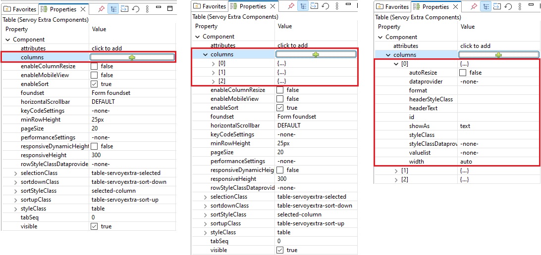
Set the columns; this can be done via wizard or in the properties panel
Edit other Table properties and Table column properties
The Data Source of a Table is set in the foundset property of the component.
By default, when creating a Table, its foundset is considered to be the form's datasource. In this case, a column's dataprovider can be chosen from the foundset table (table column, calculations, aggregates), form variables, scope variables, as well as tables related to the foundset's one.
Table's foundset can be changed to a Related Foundset, Separate foundset or Named foundsets. In case of a Related Foundset a column's dataprovider can be chosen from the related table (table column, calculations, aggregates), form variables, scope variables.
After dragging the component on the form, the Property configurator for columns
wizard appears. Close the editor without setting anything here, find the Table in the form editor, click it and proceed with the following steps:
Add a column. There are 2 ways of adding a column:
Select the columns
property and click the +
button in order to add a column. Next columns can be added the same way or by clicking the +
button (insert a new array item below
) of another column. You can change the columns' order by dragging them into the desired placed inside the Table (in the form editor).
Drag and drop column
component (of an Table in Grids section in the components' pallet) into the Table component (in the form editor)
Expand the columns
property to see the list of columns. They are also shown in the Table component (in the form editor)
In order to edit each column, expand it or click the column name in the Table component (in the form editor) and set its properties
Table column
It is necessary to set an unique id
in the Table column properties.
Example: orderid
.
A column's data provider is set in the dataprovider property of the Table Column.
In case the Table foundset is set as Form foundset, Separate foundset or Named foundsets, a column's dataprovider can be selected from the foundset table (table column, calculations, aggregates), form variables, scope variables, as well as tables related to the foundset's one.
In case of a Related Foundset, a column's dataprovider can be selected only from the related table (table column, calculations, aggregates), form variables, scope variables.
Column Header is set in the headerText property of the Column. It can be edited by entering a value in the property field or by entering the Text Property Editor. Usually this will be plain text or it can contain data from table columns, aggregations, calculations, relations or from and scopes variables, all of them can be combined, as well. i18n is also supported.
Examples:
After dragging the component on the form, the Property configurator for columns wizard appears. In order to set the columns using the wizard, you need to do the following steps:
Find in the left side of the wizard the column you need: it can be part of a related or unrelated datasource, calculations, form and scope variables, aggregates
Click on the column name
The selected column will appear on the right side of the wizard, showing some of the column properties:
COLUMNS
: the column's dataprovider
or styleClassDataprovider
DATAPROVIDER
: selected if the column id value represents the column's dataprovider
STYLECLASSDATAPROVIDER
: selected if the column id value represents the column's styleClass dataprovider
STYLECLASS
: the name of the style class that should be applied to this component.
HEADERTITLE
: the column's title text (i18n supported)
delete
icon : you can remove a tab by clicking the icon
Click OK
button after all columns have been added
When using the wizard, column id property is automatically set:
the same as dataprovider
- in case the COLUMN
was set as DATAPROVIDER
at creating stage; example: orderid
.
idX
, where X
starts from 0 and increments according to the number of columns that are set as STYLECLASSDATAPROVIDER
at creating stage; example: id0
, id1
, id2
, etc.
Column ids can be manually changed by the user in the column properties panel.
You can set pageSize > 0
for fixed page sizes, or pageSize 0
to disable paging; we intend to add pageSize -1 for auto-determining page size based on available height but that is not implemented yet.
This can work together with paging as well, so you can have a large page size and incremental scrolling would still work.
Incremental scrolling means that if many rows are available (hundreds/thousands) only then rows surrounding the ones that need to be shown will be loaded from server and only a part of those will initially be rendered (added to the browser's DOM).
When the user scrolls, more rows will be loaded from server if needed and more rows will be rendered as needed.
The purpose of all this is that, for example, if you have 1000 rows and selected row is 823, we don't send to the browser the data for all 1000 rows and render thousands of cells in browser. Just some rows around the visible area (which initially will show selected row 823) will be loaded and some of them rendered. This can drop initial show time from tens of seconds or minutes (depending also on the data in each column, connection speed, hardware, ...) to less then one second.
Incremental scrolling can be controlled/customized or virtually disabled by modifying the following properties in properties view:
The values above are the default values that should be fine for most situations. If you want to tweak them, here is what they mean:
performanceSettings.minBatchSizeForRenderingMoreRows: influences the minimum of:
how many rows around the initial visible area will be rendered initially;
(when scrolling) how many more rows get rendered each time in the direction of the scroll - in advance. This is done so that when the user scrolls, content is prepared for being shown. The default value is 10.
The real value of initial rendered rows and of additional batch sizes for rendering is actually calculated from the visible height that the table has to work with in the browser, but it cannot go lower then what this setting requires.
If you want to disable incremental rendering, just set a very high value for this setting and then all available (loaded from server) rows will be rendered right away (this makes sense when combined with paging - acceptable page size).
performanceSettings.minBatchSizeForLoadingMoreRows: influences the minimum of:
how many rows around the initial visible area will be loaded from server initially;
(when scrolling) how many more rows get loaded from server each time in the direction of the scroll - in advance. When the user scrolls, row data is received from server ahead of the scroll so that more rows can be rendered. The default value is 20.
The real value of initial loaded rows and of additional batch sizes for loading rows from server is actually calculated based on the visible height that the table has to work with in the browser, but it cannot go lower then what this setting requires.
If you want to disable incremental loading of row data, just set a very high value in there and then all needed rows will be loaded from server (this makes sense when combined with paging - acceptable page size).
performanceSettings.maxRenderedRows: in order to not slow down browser UI due to a huge number of DOM elements being created, this limits the number of rows that the table will render.
If the user scrolls a lot and this results in more then 'maxRenderedRows' being rendered - the table will discard a part of the rendered rows and start fresh - as if it was rendering initially around the visible area.
If you set a high value, many rows can get rendered in the browser and then you will have a more natural feel when scrolling fast back to already rendered rows. But if the value is too high and the browser slows down too much it is better to start fresh with less rendered rows more often (so have this set to a lower value).
Default value is 450 (although some browser & hardware can handle nicely even more rendered rows, depending also on content).
performanceSettings.maxLoadedRows: in order to not use too much memory in the browser due to a huge number of rows (row data) being loaded, this limits the number of rows that the table will keep loaded.
If the user scrolls a lot and this results in more then 'maxLoadedRows' being loaded - the table will discard a part of the loaded rows.
If you set a high value, many rows can get loaded in the browser and then you will have a more natural feel when scrolling fast back to already loaded rows. But if the value is too high the browser memory usage might grow too much and it is better to discard part of the loaded rows (from the opposite side then user is scrolling to).
Default value is 1000 (although some hardware can handle nicely even more loaded rows, depending also on content).
performanceSettings.fastScrollRenderThresholdFactor: Default value: 3.0 (float); if for example you have a table with 1000 rows and initially the selected row is shown at index 700 - rendered rows and loaded rows will be around the visible area. Then if the user grabs the scroll knob with the mouse and drags fast upwards to the beginning we have to discard what we have rendered and render the first set of rows instead.
We cannot just render batches of rows one by one upwards until we reach the first row because that will take a very long time. This setting determines when the table component considers a scroll operation to be a "fast-scroll" that needs a discard of currently rendered rows and a render of the new visible area.
When the scroll position is more then 'fastScrollRenderThresholdFactor * initiallyRenderedRows' apart from currently rendered rows, the scroll operation is considered to need a completely new set of rendered rows.
performanceSettings.fastScrollLoadThresholdFactor: Default value: 2.3 (float); if for example you have a table with 1000 rows and initially the selected row is shown at index 700 - rendered rows and loaded rows will be around the visible area. Then if the user grabs the scroll knob with the mouse and drags fast upwards to the beginning we have to discard what we have loaded and load the first set of rows instead.
We cannot just load from server batches of rows one by one upwards until we reach the first row because that will take a very long time. This setting determines when the table component considers a scroll operation to be a "fast-scroll" that needs a discard of currently loaded rows and a load of rows from the new visible area.
When the scroll position is more then 'fastScrollLoadThresholdFactor * initiallyLoadedRows' apart from currently loaded rows, the scroll operation is considered to need a completely new set of loaded rows.
If you modify any of these performance settings, please make sure that:
It can be used both in responsive forms and absolute forms. If used in responsive mode, its responsiveHeight property must be set in Properties View (which is the fixed height it will occupy).
Adding a table in a flex-content layout and setting the table responsiveHeight property to 0
, let the table grow up to 100% height of parent element (see more on flex-layout here). Used with other containers than flex-content layout in order to grow the table to 100% height, the parent element must have a known height.
In order to have sortable columns by clicking on the column's header, the enableSort property of the Table must be set to true
. This will take effect on all columns.
Columns width can be set as pixel value (ex. 50px
), as a percentage of the table width (25%
), or it can be left empty, and in this case it will have an automatic value calculated to fill the table width;
If the autoResize flag of a column is set, the width of the column will increase/decrease when the width of the table is increasing/decreasing (ex. the table is anchored to right, and the window is resized), in order to fill/empty the extra width of the table;
In order to allow the user to resize columns, the enableColumnResize property of the Table must be set to true
.
Columns' Format can be set in format property of each column. Depending on the type of each dataprovider, this will be done via the format editors for date, text, integer/number.
Example:
Focusing on the Ship country
column of the following Table, without having any format:
If the countries' names need to be all upper case, then we apply a Format to the Ship country
column of the Table:
Here is how it looks after the Format has been set:
On key press of any below keyboard codes we can activate different actions on the table. Also allows us to enable or disable this option per key.
Key Code Settings can be found here.
pageUp : Move down to last visible item in view
pageDown : Move up to first visible item in view
arrowUp : Move up one record in table
arrowDown : Move down one record in table
home : Move to the first record in the table
end : Move to the last record in the table
enter : Fire the onCellClick event
You can find a list of Table events here. You can find a list of Table API methods here.
This event is called when the mouse is clicked on a row/cell (foundset and column indexes are given). When the ENTER key is used then only the selected foundset index is given. It uses the record to exactly match where the user clicked on.
Here is an example of how to use the onCellClick event of Table in the Scripting Editor:
Let's consider a Table showing employees
table columns. When clicking on a table cell, the application will show a form containing details of that specific employee record.
This event is called when the right mouse button is clicked on a row/cell (foundset and column indexes are given). When the ENTER key is used then only the selected foundset index is given. It uses the record to exactly match where the user clicked on.
Here is an example of how to use the onCellRightClick event of Table in the Scripting Editor:
Let's consider a Table showing employees
table columns. When right clicking on a table cell, the application will show a pop up form containing an employees card menu of that specific employee record.
Here is an example of how to programmatically add a column in the Scripting Editor of the main form, using the the newColumn API:
Here is an example of how to programmatically remove a column in the Scripting Editor of the main form, using the the removeColumn API: